


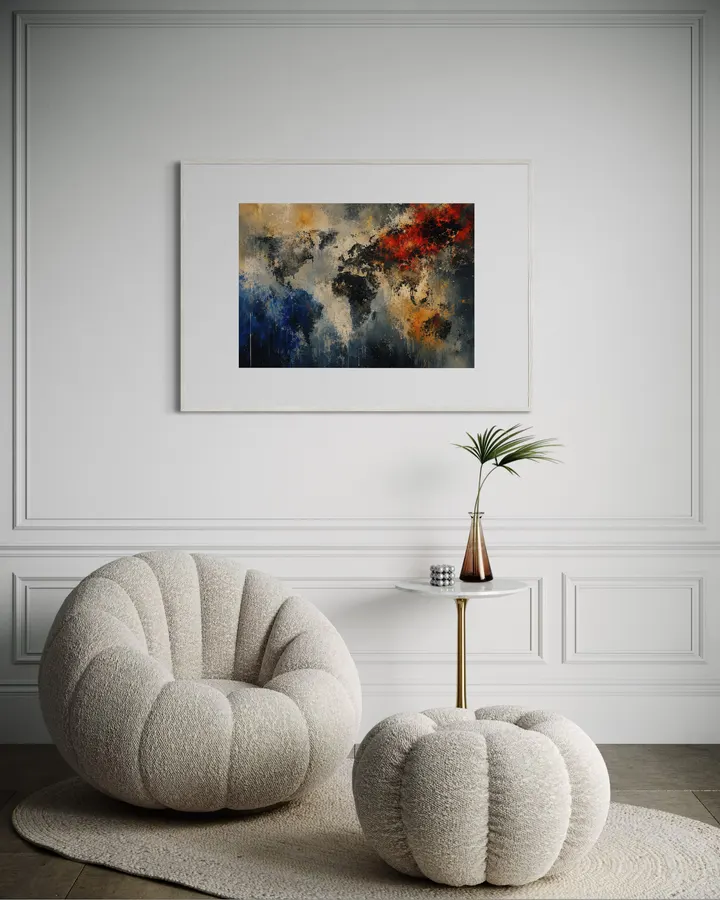
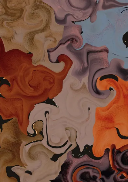
Rather than depicting the state of the world in 2026 as a literal map, I wanted to portray the "distance" between events unfolding simultaneously within the same world. Red represents war, conflict, anger, and sudden change. Blue represents everyday life and silence continuing elsewhere, far from those events. Yellow represents a future that has not yet been decided. It can appear as hope, or as a warning. It may be the light of recovery, or the beginning of another period of turmoil. That is why yellow is not used to represent the present, but as the possibility of something yet to come. The fractured black forms may resemble nations or borders, but they were never intended to form a complete map. What caught my attention was that while something immense may be happening somewhere in the world, elsewhere people are eating, sleeping, going to work, and reaching the end of another ordinary day as if nothing had happened. The gray-white space spreading across the center of the work represents the "distance" between these realities. It is not only a physical distance. It is also the distance between knowing that something is happening and actually feeling it. Red is what is happening. Blue is what continues despite it. Yellow is what has not yet been decided. And what interested me most was the ambiguous space between them — a place that does not completely belong to any one color. That is where the world of 2026 seemed to be. MORA / 2026 There is always something there.
《THE DISTANCE BETWEEN FIRES》 「火と火のあいだの距離」— 《THE DISTANCE BETWEEN FIRES》 "The Distance Between Fires"
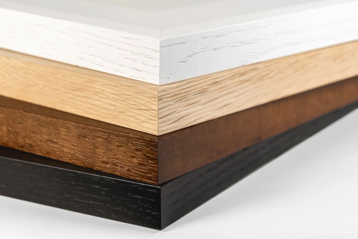
High-quality giclée printing using 12-color pigment inks and 0.35mm fine art paper. Faithfully reproduces the texture and brushstrokes of the original work, with lightfastness of approximately 200 years.
Orders placed by noon ship the same day. Enjoy new art in your space without delay.
Rather than depicting the state of the world in 2026 as a literal map, I wanted to portray the "distance" between events unfolding simultaneously within the same world. Red represents war, conflict, anger, and sudden change. Blue represents everyday life and silence continuing elsewhere, far from those events. Yellow represents a future that has not yet been decided. It can appear as hope, or as a warning. It may be the light of recovery, or the beginning of another period of turmoil. That is why yellow is not used to represent the present, but as the possibility of something yet to come. The fractured black forms may resemble nations or borders, but they were never intended to form a complete map. What caught my attention was that while something immense may be happening somewhere in the world, elsewhere people are eating, sleeping, going to work, and reaching the end of another ordinary day as if nothing had happened. The gray-white space spreading across the center of the work represents the "distance" between these realities. It is not only a physical distance. It is also the distance between knowing that something is happening and actually feeling it. Red is what is happening. Blue is what continues despite it. Yellow is what has not yet been decided. And what interested me most was the ambiguous space between them — a place that does not completely belong to any one color. That is where the world of 2026 seemed to be. MORA / 2026 There is always something there.
Exceptional Quality
Similar in style
More from this artist
Cart
Your cart is empty