


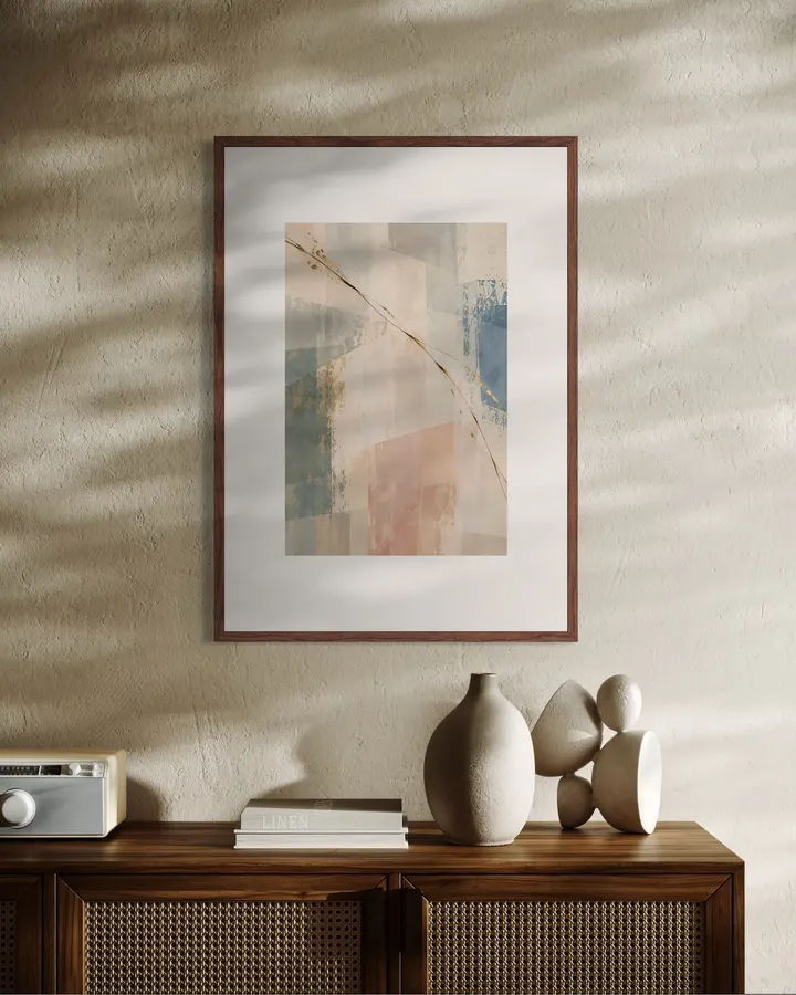
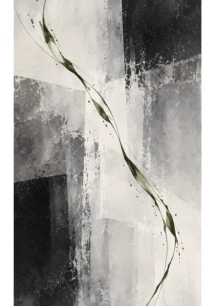
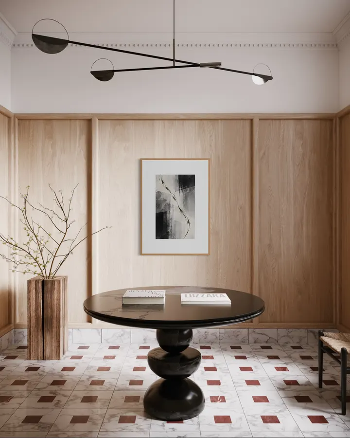
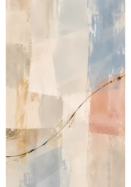
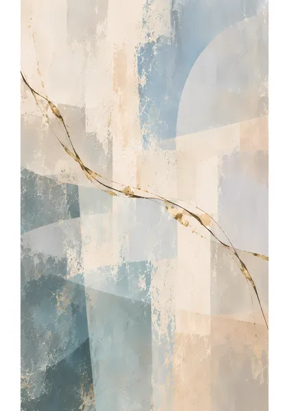
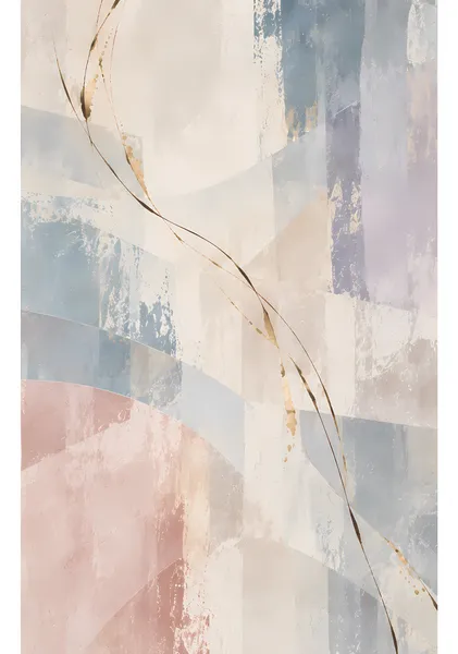
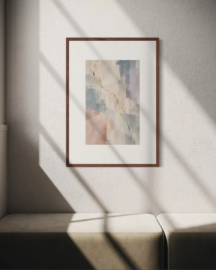
Vertical fields of muted teal, blue, and pale pink are traversed from upper left to lower right by a fine line of brown, black, and worn gold. By distributing the visual weight across multiple color anchors, the composition holds a quiet stillness while carrying a sense of openness and movement. Vertical layers of muted teal, blue, and pale pink are traversed by a fine line of brown, black, and worn gold. Multiple color anchors give the quiet surface a sense of breadth and movement. SERIES — CURRENT CURRENT is a series built around the sense of flow (currents of movement passing through layered planes of color) created when a single line crosses overlapping fields of color and texture. The first half centers on ivory, pale blue, blush, and beige, with lines in brown, black, and worn gold. In the second half, the ground shifts to a monochrome range from white to black, and color is given to the line itself—green, red, gold, blue, and orange. The line is never drawn evenly; it thins, breaks, pools, and drifts as it crosses the surface. Ten works that hold a quiet field while leaving just enough direction and motion within it. CURRENT is a series built around the sense of movement created when a single line passes through layered fields of color and texture. The first half uses ivory, pale blue, blush, and beige with traces of brown, black, and worn gold. In the second half, the ground shifts to monochrome while the line itself carries color—green, red, gold, blue, and orange. The line is never perfectly even; it thins, breaks, gathers, fades, and reappears as it crosses the surface. Together, the ten works hold a quiet field while leaving just enough direction and motion within it. ABOUT RITSUKO NISHIMURA Ritsuko Nishimura makes abstract and semi-abstract works with a guiding intention: that a piece should feel genuinely good to live with. Rather than asserting a strong statement, her practice centers on balance—light, air, the breathing space of quiet passages, and the interplay of color and mark. The works settle naturally into calm, hotel-inspired and contemporary interiors, made to be looked at and returned to over time. Ritsuko Nishimura creates abstract and semi-abstract works with a simple aim: to make a room feel good to live with. Rather than forcing a strong statement, her work focuses on balance—light, air, quiet space, color, and the physical character of each mark. The pieces are designed to sit naturally in calm, hotel-inspired and contemporary interiors, offering something that can be lived with and looked at over time.
CURRENT 04 — Traverse
High-quality giclée printing using 12-color pigment inks and 0.35mm fine art paper. Faithfully reproduces the texture and brushstrokes of the original work, with lightfastness of approximately 200 years.
Orders placed by noon ship the same day. Enjoy new art in your space without delay.
Vertical fields of muted teal, blue, and pale pink are traversed from upper left to lower right by a fine line of brown, black, and worn gold. By distributing the visual weight across multiple color anchors, the composition holds a quiet stillness while carrying a sense of openness and movement. Vertical layers of muted teal, blue, and pale pink are traversed by a fine line of brown, black, and worn gold. Multiple color anchors give the quiet surface a sense of breadth and movement. SERIES — CURRENT CURRENT is a series built around the sense of flow (currents of movement passing through layered planes of color) created when a single line crosses overlapping fields of color and texture. The first half centers on ivory, pale blue, blush, and beige, with lines in brown, black, and worn gold. In the second half, the ground shifts to a monochrome range from white to black, and color is given to the line itself—green, red, gold, blue, and orange. The line is never drawn evenly; it thins, breaks, pools, and drifts as it crosses the surface. Ten works that hold a quiet field while leaving just enough direction and motion within it. CURRENT is a series built around the sense of movement created when a single line passes through layered fields of color and texture. The first half uses ivory, pale blue, blush, and beige with traces of brown, black, and worn gold. In the second half, the ground shifts to monochrome while the line itself carries color—green, red, gold, blue, and orange. The line is never perfectly even; it thins, breaks, gathers, fades, and reappears as it crosses the surface. Together, the ten works hold a quiet field while leaving just enough direction and motion within it. ABOUT RITSUKO NISHIMURA Ritsuko Nishimura makes abstract and semi-abstract works with a guiding intention: that a piece should feel genuinely good to live with. Rather than asserting a strong statement, her practice centers on balance—light, air, the breathing space of quiet passages, and the interplay of color and mark. The works settle naturally into calm, hotel-inspired and contemporary interiors, made to be looked at and returned to over time. Ritsuko Nishimura creates abstract and semi-abstract works with a simple aim: to make a room feel good to live with. Rather than forcing a strong statement, her work focuses on balance—light, air, quiet space, color, and the physical character of each mark. The pieces are designed to sit naturally in calm, hotel-inspired and contemporary interiors, offering something that can be lived with and looked at over time.
Exceptional Quality
Similar in style








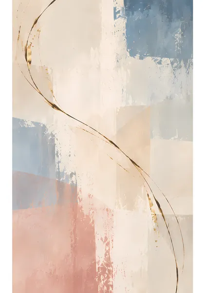
More from this artist


Cart
Your cart is empty