Cart
Your cart is empty
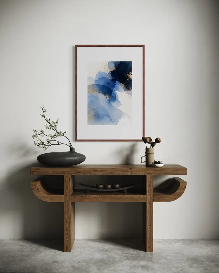
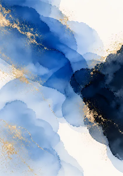
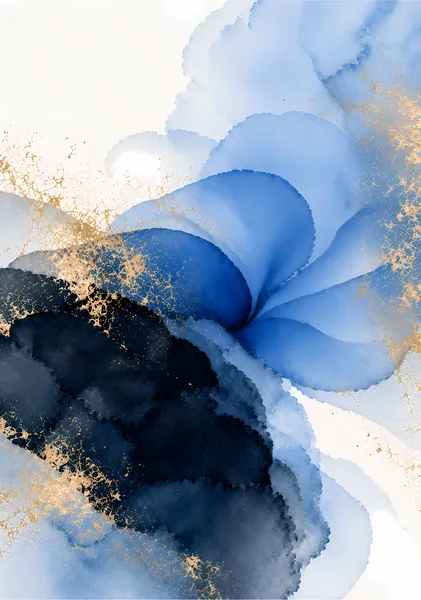
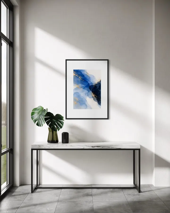
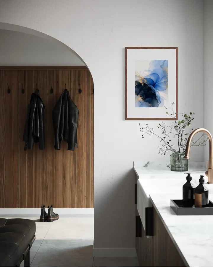
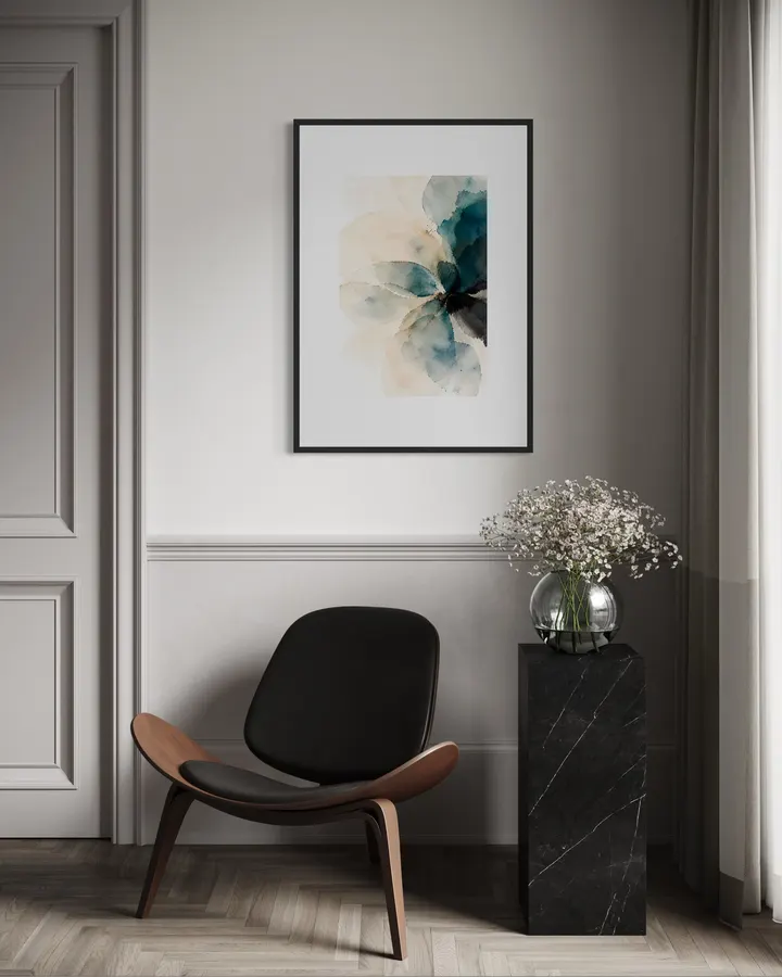
Layers of blue watercolor are built up on white paper, deepening toward a dark navy at the upper right, with flecks of gold scattered throughout. It would look lovely hung in a bedroom with white walls, or in a calm, understated living room. SERIES — INDIGO INDIGO is a three-piece series of blue watercolor washes layered on white paper, with flecks of gold. The blues range from pale sky to deep indigo, shifting in depth and form from piece to piece. The palette sits easily in rooms with white, gray, or natural wood tones. ABOUT RITSUKO NISHIMURA Ritsuko Nishimura creates abstract and semi-abstract works with a simple aim: to make a room feel good to live with. Rather than forcing a strong statement, her work focuses on balance — light, air, the quiet breathing room of ma (negative space used as an expressive element), color, and the physical character of each mark. The pieces are designed to sit naturally in calm, hotel-inspired and contemporary interiors, offering something that can be lived with and looked at over time.
High-quality giclée printing using 12-color pigment inks and 0.35mm fine art paper. Faithfully reproduces the texture and brushstrokes of the original work, with lightfastness of approximately 200 years.
Orders placed by noon ship the same day. Enjoy new art in your space without delay.
Layers of blue watercolor are built up on white paper, deepening toward a dark navy at the upper right, with flecks of gold scattered throughout. It would look lovely hung in a bedroom with white walls, or in a calm, understated living room. SERIES — INDIGO INDIGO is a three-piece series of blue watercolor washes layered on white paper, with flecks of gold. The blues range from pale sky to deep indigo, shifting in depth and form from piece to piece. The palette sits easily in rooms with white, gray, or natural wood tones. ABOUT RITSUKO NISHIMURA Ritsuko Nishimura creates abstract and semi-abstract works with a simple aim: to make a room feel good to live with. Rather than forcing a strong statement, her work focuses on balance — light, air, the quiet breathing room of ma (negative space used as an expressive element), color, and the physical character of each mark. The pieces are designed to sit naturally in calm, hotel-inspired and contemporary interiors, offering something that can be lived with and looked at over time.



Your cart is empty