カート
カートに商品がありません
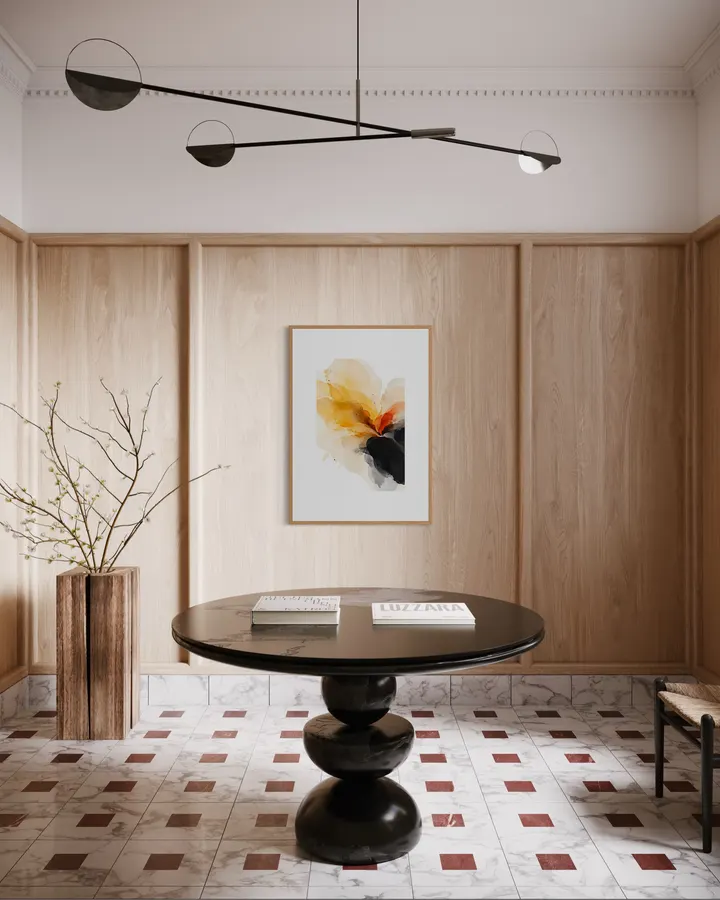
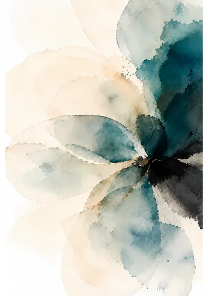
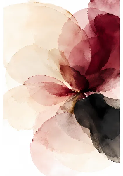
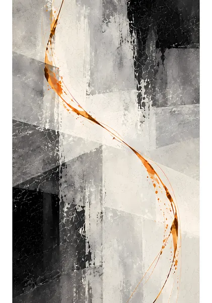
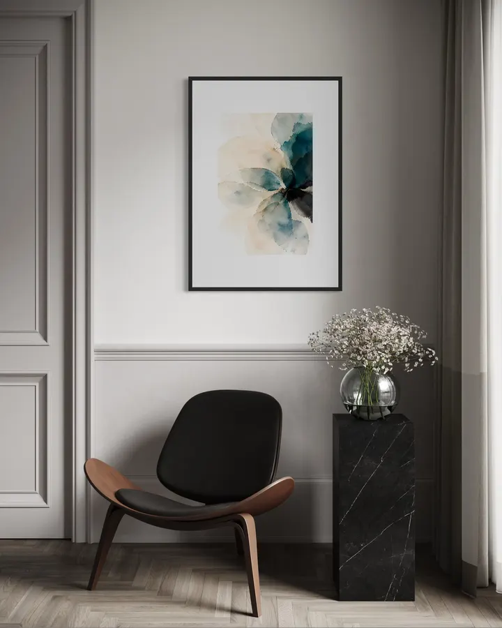
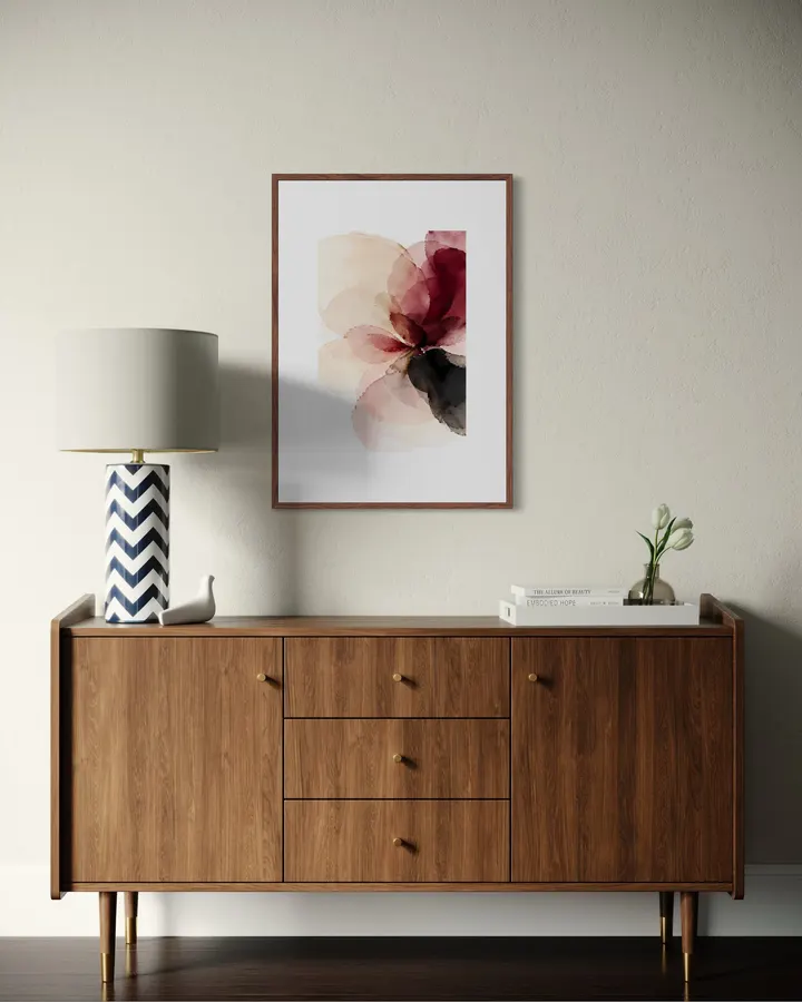
淡い黄色や琥珀色の透明な色面に、黒を大きく重ねた作品です。 水彩のようなにじみや透けを残しながら、形をはっきり描きすぎず、見ているうちに花のようにも感じられる仕上がりにしました。 明るい色だけでは少し物足りない部屋にも、黒が入ることで全体が引き締まります。 花をそのまま描いた絵ではありませんが、部屋に花を飾るような気持ちで楽しんでもらえたらうれしいです。 SERIES — BLOOMFORM BLOOMFORMは、花そのものを細かく描くのではなく、水彩のにじみや透明な色の重なりから花の気配をつくった3作品のシリーズです。 茎や葉は描かず、丸みのある色面と余白だけで構成しています。 黄色と琥珀、バーガンディ、ティールと、それぞれ違う色を使いましたが、どの作品も「花だとはっきり描きすぎない」ことを大切にしました。 生花を飾るのが難しい部屋でも、花があるときのように、少し空間が明るくなったり気分が変わったりする。 そんな存在になればと思って制作したシリーズです。 BLOOMFORM is a three-piece series inspired by the feeling of flowers rather than detailed botanical forms. Instead of stems and leaves, each work is built from translucent watercolor-like shapes, soft overlaps and open space. The three pieces use different color families — saffron and amber, burgundy, and teal — while sharing the same idea of suggesting a flower without describing it too clearly. I created the series with rooms in mind where keeping fresh flowers may not always be practical. I hope each piece can bring a little color, softness and the feeling of having flowers nearby. ABOUT RITSUKO NISHIMURA Ritsuko Nishimuraは、色、余白、光、重なりを大切にしながら作品を制作しています。 何かを細かく描き込むよりも、色や形を少し残したところで止め、見る人が自由に感じられる余白を残すことを意識しています。 部屋に飾ったときに主張しすぎず、それでもふと目に入ったときに少し気分が変わる。 そんな作品を目指しています。 Ritsuko Nishimura creates artwork with a focus on color, space, light and layered forms. Rather than filling every part of an image with detail, she prefers to stop while there is still room for the viewer to interpret the work in their own way. Her aim is to create art that does not overpower a room, but still offers a small change of mood whenever it catches the eye.
12色顔料インクと0.35mm厚のファインアート紙が織りなす高品質なジークレー印刷。原画の質感やタッチを忠実に再現し、約200年の耐光性を有します。
お昼12時までのご注文は当日中に発送。お待たせすることなく、お部屋を彩る新しいアートをすぐにお楽しみいただけます。
淡い黄色や琥珀色の透明な色面に、黒を大きく重ねた作品です。 水彩のようなにじみや透けを残しながら、形をはっきり描きすぎず、見ているうちに花のようにも感じられる仕上がりにしました。 明るい色だけでは少し物足りない部屋にも、黒が入ることで全体が引き締まります。 花をそのまま描いた絵ではありませんが、部屋に花を飾るような気持ちで楽しんでもらえたらうれしいです。 SERIES — BLOOMFORM BLOOMFORMは、花そのものを細かく描くのではなく、水彩のにじみや透明な色の重なりから花の気配をつくった3作品のシリーズです。 茎や葉は描かず、丸みのある色面と余白だけで構成しています。 黄色と琥珀、バーガンディ、ティールと、それぞれ違う色を使いましたが、どの作品も「花だとはっきり描きすぎない」ことを大切にしました。 生花を飾るのが難しい部屋でも、花があるときのように、少し空間が明るくなったり気分が変わったりする。 そんな存在になればと思って制作したシリーズです。 BLOOMFORM is a three-piece series inspired by the feeling of flowers rather than detailed botanical forms. Instead of stems and leaves, each work is built from translucent watercolor-like shapes, soft overlaps and open space. The three pieces use different color families — saffron and amber, burgundy, and teal — while sharing the same idea of suggesting a flower without describing it too clearly. I created the series with rooms in mind where keeping fresh flowers may not always be practical. I hope each piece can bring a little color, softness and the feeling of having flowers nearby. ABOUT RITSUKO NISHIMURA Ritsuko Nishimuraは、色、余白、光、重なりを大切にしながら作品を制作しています。 何かを細かく描き込むよりも、色や形を少し残したところで止め、見る人が自由に感じられる余白を残すことを意識しています。 部屋に飾ったときに主張しすぎず、それでもふと目に入ったときに少し気分が変わる。 そんな作品を目指しています。 Ritsuko Nishimura creates artwork with a focus on color, space, light and layered forms. Rather than filling every part of an image with detail, she prefers to stop while there is still room for the viewer to interpret the work in their own way. Her aim is to create art that does not overpower a room, but still offers a small change of mood whenever it catches the eye.




カートに商品がありません