カート
カートに商品がありません
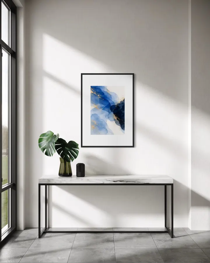
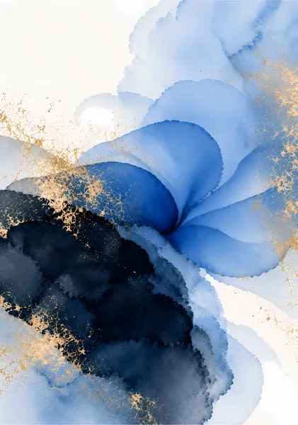
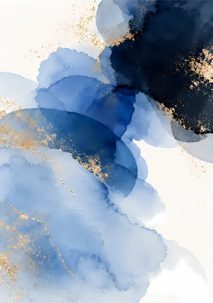
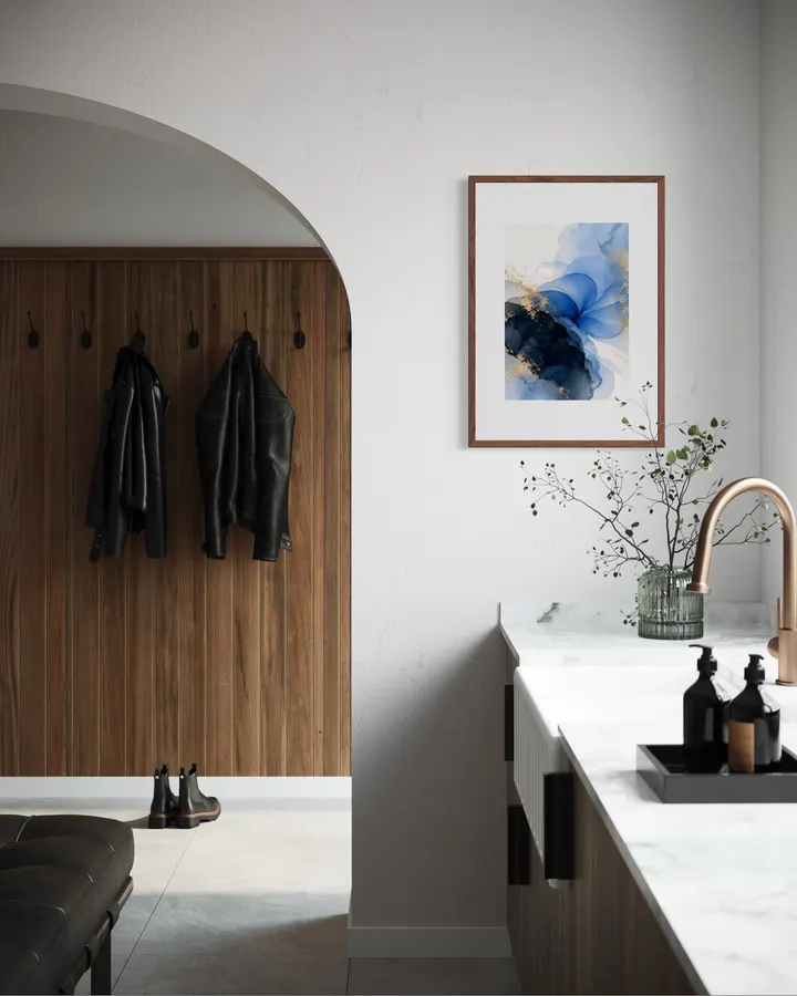
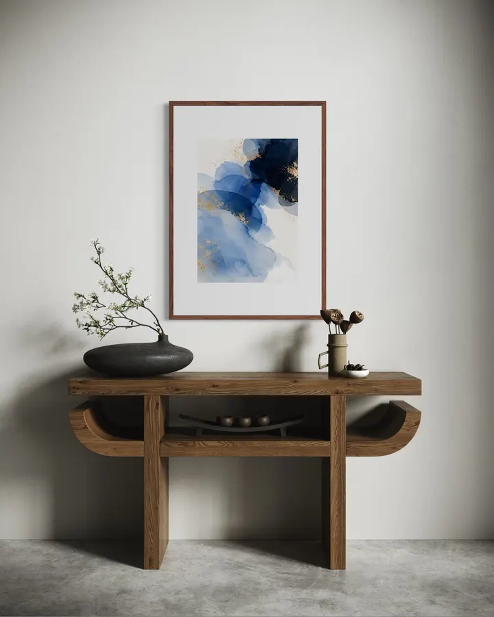
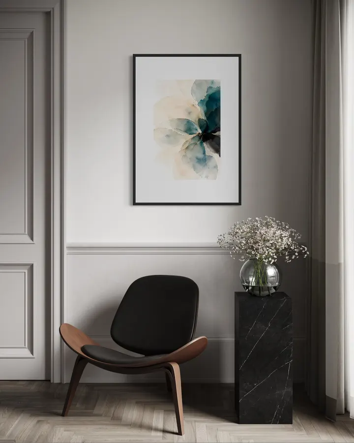
左から明るい青が流れ、右側の深い紺色へとつながっていく作品です。金色の線と粒が、水面の光のように散っています。書斎や仕事部屋など、気持ちを落ち着けたい場所におすすめです。 Bright blue flows in from the left and meets a deep navy on the right, while lines and flecks of gold scatter like light on water. It suits a study or home office where you want to feel calm. SERIES — INDIGO INDIGOは、白い紙に青の水彩を重ね、金色を散らした3点のシリーズです。淡い空色から深い藍色まで、同じ青でも作品ごとに濃さと形が変わります。白やグレー、木の色の部屋にもなじみやすい色合いです。 INDIGO is a three-piece series of blue watercolor washes layered on white paper, with flecks of gold. The blues range from pale sky to deep indigo, changing in depth and shape from piece to piece. The palette sits easily in rooms with white, gray, or natural wood tones. ABOUT RITSUKO NISHIMURA Ritsuko Nishimuraは、部屋に飾ったときに心地よく感じられることを大切に、抽象画や半抽象の風景を制作しています。強い主張を置くよりも、光、空気、静けさを感じる余白と、色や筆致のバランスを重視しています。ホテルライクな空間や落ち着いたインテリアにも自然になじみ、日常の中で長く眺められる作品を目指しています。 Ritsuko Nishimura creates abstract and semi-abstract works with a simple aim: to make a room feel good to live with. Rather than forcing a strong statement, her work focuses on balance—light, air, quiet space, color, and the physical character of each mark. The pieces are designed to sit naturally in calm, hotel-inspired and contemporary interiors, offering something that can be lived with and looked at over time.
12色顔料インクと0.35mm厚のファインアート紙が織りなす高品質なジークレー印刷。原画の質感やタッチを忠実に再現し、約200年の耐光性を有します。
お昼12時までのご注文は当日中に発送。お待たせすることなく、お部屋を彩る新しいアートをすぐにお楽しみいただけます。
左から明るい青が流れ、右側の深い紺色へとつながっていく作品です。金色の線と粒が、水面の光のように散っています。書斎や仕事部屋など、気持ちを落ち着けたい場所におすすめです。 Bright blue flows in from the left and meets a deep navy on the right, while lines and flecks of gold scatter like light on water. It suits a study or home office where you want to feel calm. SERIES — INDIGO INDIGOは、白い紙に青の水彩を重ね、金色を散らした3点のシリーズです。淡い空色から深い藍色まで、同じ青でも作品ごとに濃さと形が変わります。白やグレー、木の色の部屋にもなじみやすい色合いです。 INDIGO is a three-piece series of blue watercolor washes layered on white paper, with flecks of gold. The blues range from pale sky to deep indigo, changing in depth and shape from piece to piece. The palette sits easily in rooms with white, gray, or natural wood tones. ABOUT RITSUKO NISHIMURA Ritsuko Nishimuraは、部屋に飾ったときに心地よく感じられることを大切に、抽象画や半抽象の風景を制作しています。強い主張を置くよりも、光、空気、静けさを感じる余白と、色や筆致のバランスを重視しています。ホテルライクな空間や落ち着いたインテリアにも自然になじみ、日常の中で長く眺められる作品を目指しています。 Ritsuko Nishimura creates abstract and semi-abstract works with a simple aim: to make a room feel good to live with. Rather than forcing a strong statement, her work focuses on balance—light, air, quiet space, color, and the physical character of each mark. The pieces are designed to sit naturally in calm, hotel-inspired and contemporary interiors, offering something that can be lived with and looked at over time.

カートに商品がありません