


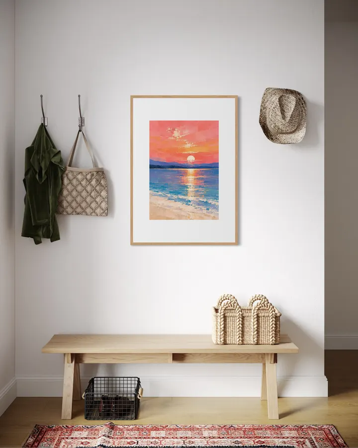
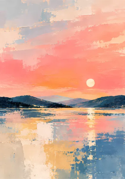
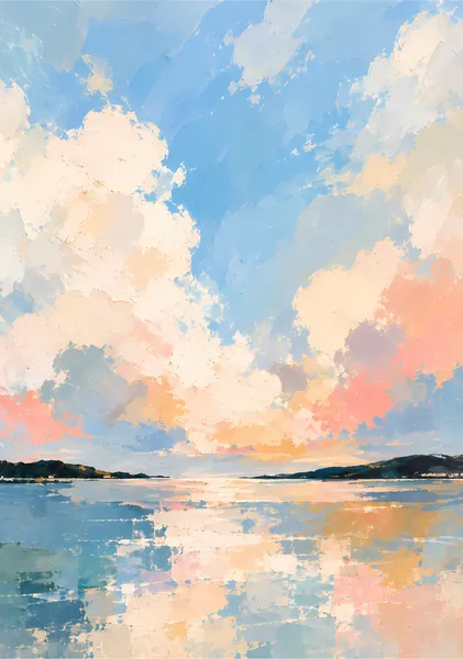
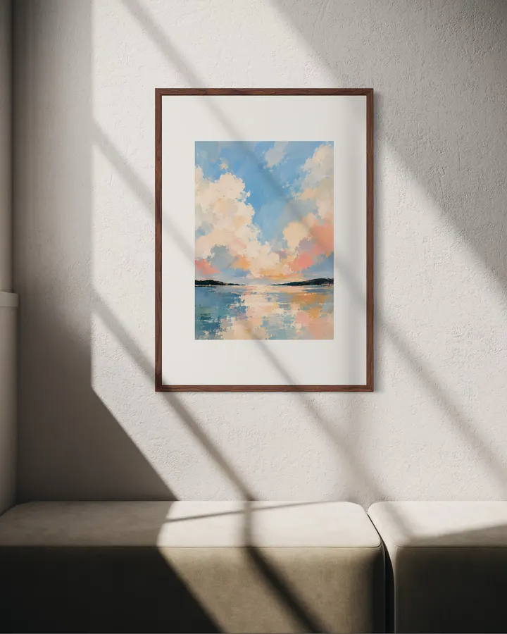
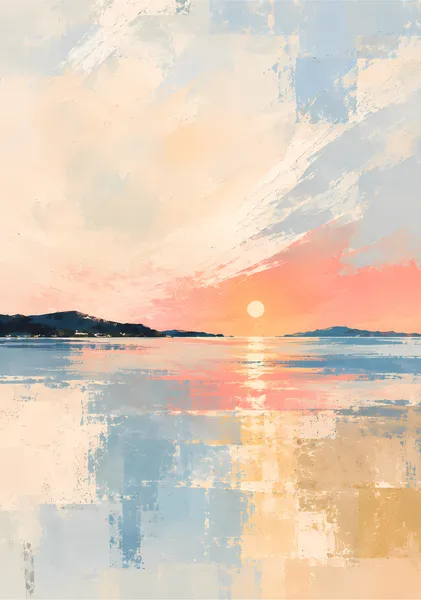
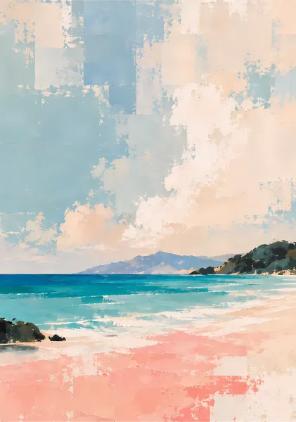
コーラル、ピンク、オレンジの夕空と、青からラベンダーの水面が鮮やかに対比する夕景。白い太陽から縦に伸びる光の反射を中心に、遠い山並みと淡い砂浜をシンプルに配置しています。強い色を使いながらも、画面全体は穏やかにまとめています。 A vivid sunset where coral, pink, and orange sky meets blue and lavender water. A pale sun and its vertical reflection form the center of the composition, balanced by distant hills and a light shoreline. Strong color is used with restraint to keep the overall mood calm. SERIES — QUIET PLACES QUIET PLACES は、海、湾、丘、森、島、夕景など異なる場所を、静けさという共通の感覚でつないだ10作品のシリーズです。遠くから見ると風景として読み取れ、近くでは厚塗り、カスレ、矩形の色面、削れたような質感が見えるように構成しています。描き込みすぎず、光と空気が残る余白を大切にしながら、場所ごとの色と地形の違いをわかりやすく残しました。 QUIET PLACES is a ten-work series that connects different settings—sea, bay, hills, forest, islands, and sunset—through a shared sense of stillness. From a distance, each work reads as a landscape; up close, impasto, scraped surfaces, block-like color fields, and weathered marks become visible. The series avoids over-description, leaving room for light and air while keeping the color and character of each place distinct. ABOUT RITSUKO NISHIMURA Ritsuko Nishimura は、光、空気、静けさを軸に、余白と質感を大切にした半抽象作品を制作しています。風景をそのまま再現するのではなく、色面、筆致、削れ、重なりを通して、場所に残る光や時間の感覚を組み立てています。作品では「描くこと」と同じくらい「描きすぎないこと」を重視し、見る距離によって風景と抽象の両方が感じられる画面を目指しています。 Ritsuko Nishimura creates semi-abstract works centered on light, air, stillness, open space, and material texture. Rather than reproducing a landscape literally, she builds a sense of place through fields of color, brushwork, scraped surfaces, and layered marks. Restraint is as important as addition, allowing each work to shift between recognizable landscape and abstraction depending on viewing distance.
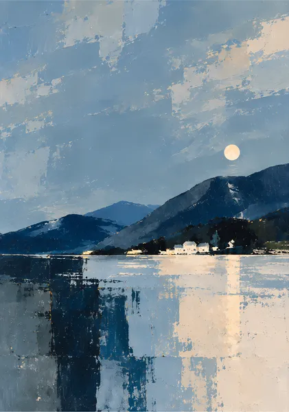
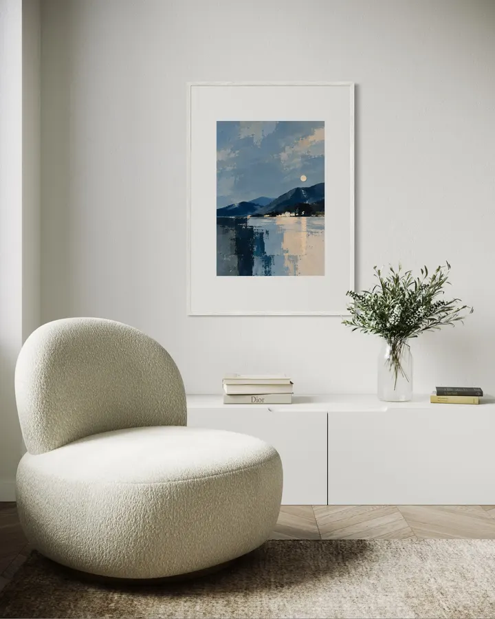
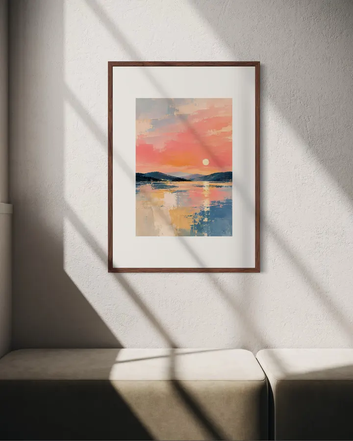
QUIET PLACES 07 — Sunset Calm— QUIET PLACES 07 — 夕暮れの静けさ
12色顔料インクと0.35mm厚のファインアート紙が織りなす高品質なジークレー印刷。原画の質感やタッチを忠実に再現し、約200年の耐光性を有します。
お昼12時までのご注文は当日中に発送。お待たせすることなく、お部屋を彩る新しいアートをすぐにお楽しみいただけます。
コーラル、ピンク、オレンジの夕空と、青からラベンダーの水面が鮮やかに対比する夕景。白い太陽から縦に伸びる光の反射を中心に、遠い山並みと淡い砂浜をシンプルに配置しています。強い色を使いながらも、画面全体は穏やかにまとめています。 A vivid sunset where coral, pink, and orange sky meets blue and lavender water. A pale sun and its vertical reflection form the center of the composition, balanced by distant hills and a light shoreline. Strong color is used with restraint to keep the overall mood calm. SERIES — QUIET PLACES QUIET PLACES は、海、湾、丘、森、島、夕景など異なる場所を、静けさという共通の感覚でつないだ10作品のシリーズです。遠くから見ると風景として読み取れ、近くでは厚塗り、カスレ、矩形の色面、削れたような質感が見えるように構成しています。描き込みすぎず、光と空気が残る余白を大切にしながら、場所ごとの色と地形の違いをわかりやすく残しました。 QUIET PLACES is a ten-work series that connects different settings—sea, bay, hills, forest, islands, and sunset—through a shared sense of stillness. From a distance, each work reads as a landscape; up close, impasto, scraped surfaces, block-like color fields, and weathered marks become visible. The series avoids over-description, leaving room for light and air while keeping the color and character of each place distinct. ABOUT RITSUKO NISHIMURA Ritsuko Nishimura は、光、空気、静けさを軸に、余白と質感を大切にした半抽象作品を制作しています。風景をそのまま再現するのではなく、色面、筆致、削れ、重なりを通して、場所に残る光や時間の感覚を組み立てています。作品では「描くこと」と同じくらい「描きすぎないこと」を重視し、見る距離によって風景と抽象の両方が感じられる画面を目指しています。 Ritsuko Nishimura creates semi-abstract works centered on light, air, stillness, open space, and material texture. Rather than reproducing a landscape literally, she builds a sense of place through fields of color, brushwork, scraped surfaces, and layered marks. Restraint is as important as addition, allowing each work to shift between recognizable landscape and abstraction depending on viewing distance.
確かな品質
似た雰囲気の作品




このアーティストの別の作品
カート
カートに商品がありません