


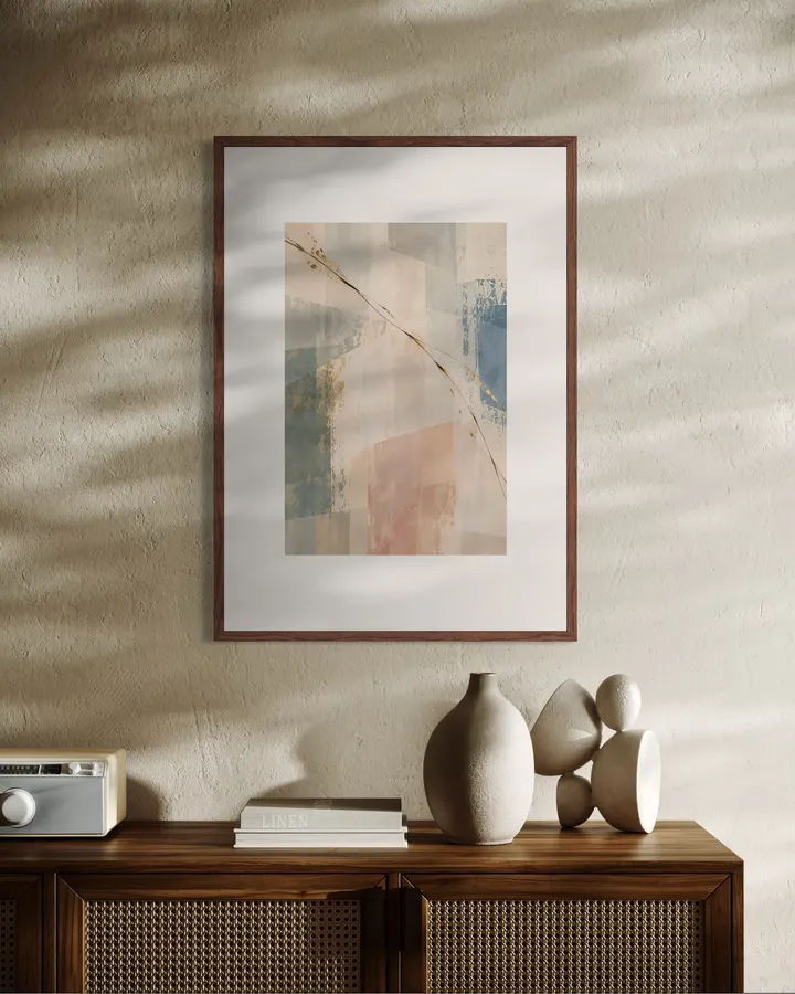
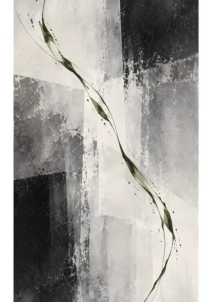
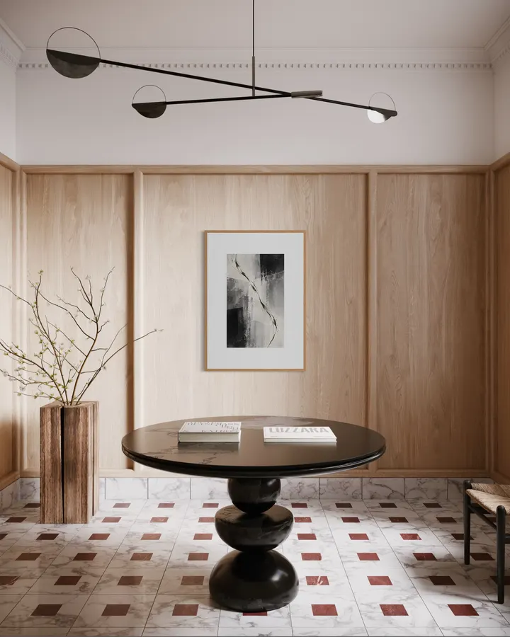
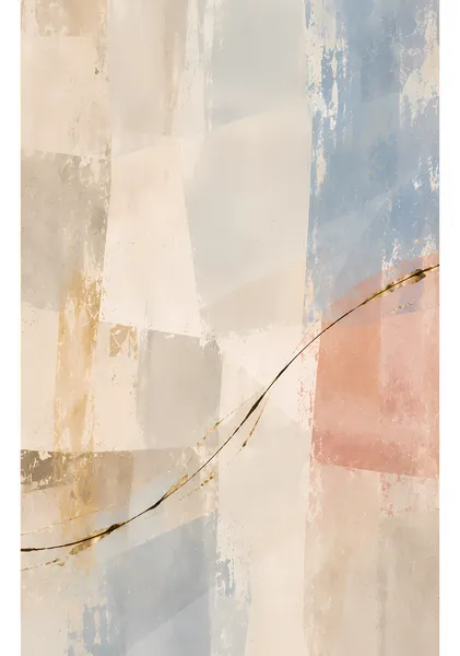
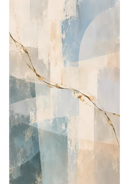
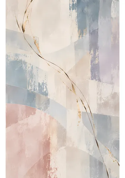
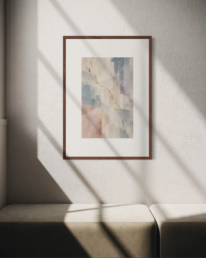
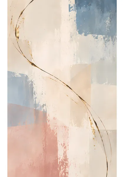
青緑、ブルー、淡いピンクを縦方向に重ねた色面を、茶・黒・金の細い線が左上から右下へ横断します。色の重心を複数に分けることで、静かな背景の中にも広がりと移動感を持たせています。 Vertical layers of muted teal, blue, and pale pink are traversed by a fine line of brown, black, and worn gold. Multiple color anchors give the quiet surface a sense of breadth and movement. SERIES — CURRENT CURRENTは、重なり合う色面の上を一本の線が通り抜けることで生まれる「流れ」を扱ったシリーズです。前半は生成りや淡いブルー、ピンク、ベージュを中心に、茶・黒・擦れた金の線を重ねています。後半は背景を白から黒までのモノクロームに切り替え、緑、赤、金、青、オレンジと、線そのものに色を持たせました。線は均一には描かず、細くなったり、途切れたり、色が溜まったりしながら画面を横切ります。静かな色面の中に、わずかな方向と動きを残す10点です。 CURRENT is a series built around the sense of movement created when a single line passes through layered fields of color and texture. The first half uses ivory, pale blue, blush, and beige with traces of brown, black, and worn gold. In the second half, the ground shifts to monochrome while the line itself carries color—green, red, gold, blue, and orange. The line is never perfectly even; it thins, breaks, gathers, fades, and reappears as it crosses the surface. Together, the ten works hold a quiet field while leaving just enough direction and motion within it. ABOUT RITSUKO NISHIMURA Ritsuko Nishimuraは、部屋に飾ったときに心地よく感じられることを大切に、抽象画や半抽象の風景を制作しています。強い主張を置くよりも、光、空気、静けさを感じる余白と、色や筆致のバランスを重視しています。ホテルライクな空間や落ち着いたインテリアにも自然になじみ、日常の中で長く眺められる作品を目指しています。 Ritsuko Nishimura creates abstract and semi-abstract works with a simple aim: to make a room feel good to live with. Rather than forcing a strong statement, her work focuses on balance—light, air, quiet space, color, and the physical character of each mark. The pieces are designed to sit naturally in calm, hotel-inspired and contemporary interiors, offering something that can be lived with and looked at over time.
CURRENT 04 — Traverse
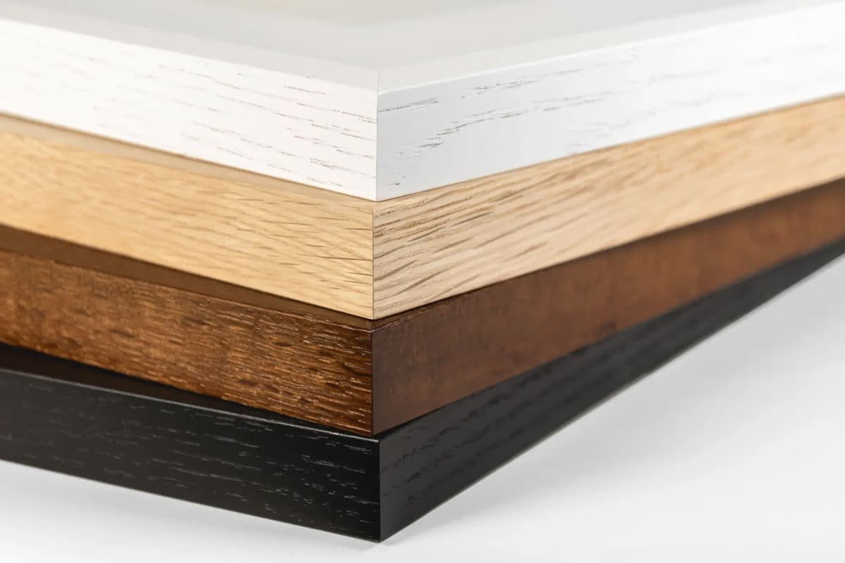
12色顔料インクと0.35mm厚のファインアート紙が織りなす高品質なジークレー印刷。原画の質感やタッチを忠実に再現し、約200年の耐光性を有します。
お昼12時までのご注文は当日中に発送。お待たせすることなく、お部屋を彩る新しいアートをすぐにお楽しみいただけます。
青緑、ブルー、淡いピンクを縦方向に重ねた色面を、茶・黒・金の細い線が左上から右下へ横断します。色の重心を複数に分けることで、静かな背景の中にも広がりと移動感を持たせています。 Vertical layers of muted teal, blue, and pale pink are traversed by a fine line of brown, black, and worn gold. Multiple color anchors give the quiet surface a sense of breadth and movement. SERIES — CURRENT CURRENTは、重なり合う色面の上を一本の線が通り抜けることで生まれる「流れ」を扱ったシリーズです。前半は生成りや淡いブルー、ピンク、ベージュを中心に、茶・黒・擦れた金の線を重ねています。後半は背景を白から黒までのモノクロームに切り替え、緑、赤、金、青、オレンジと、線そのものに色を持たせました。線は均一には描かず、細くなったり、途切れたり、色が溜まったりしながら画面を横切ります。静かな色面の中に、わずかな方向と動きを残す10点です。 CURRENT is a series built around the sense of movement created when a single line passes through layered fields of color and texture. The first half uses ivory, pale blue, blush, and beige with traces of brown, black, and worn gold. In the second half, the ground shifts to monochrome while the line itself carries color—green, red, gold, blue, and orange. The line is never perfectly even; it thins, breaks, gathers, fades, and reappears as it crosses the surface. Together, the ten works hold a quiet field while leaving just enough direction and motion within it. ABOUT RITSUKO NISHIMURA Ritsuko Nishimuraは、部屋に飾ったときに心地よく感じられることを大切に、抽象画や半抽象の風景を制作しています。強い主張を置くよりも、光、空気、静けさを感じる余白と、色や筆致のバランスを重視しています。ホテルライクな空間や落ち着いたインテリアにも自然になじみ、日常の中で長く眺められる作品を目指しています。 Ritsuko Nishimura creates abstract and semi-abstract works with a simple aim: to make a room feel good to live with. Rather than forcing a strong statement, her work focuses on balance—light, air, quiet space, color, and the physical character of each mark. The pieces are designed to sit naturally in calm, hotel-inspired and contemporary interiors, offering something that can be lived with and looked at over time.
確かな品質
似た雰囲気の作品








このアーティストの別の作品

カート
カートに商品がありません